Harmonious, or maybe complementing each other by contrast or in a subdued monochromatic version? Color combinations, which will appear on our walls, need to be well thought out beforehand. We present some inspirations and tips.
Colors accompany us always and everywhere and those in interiors play a special role – they not only influence our mood, but with their help we can also “manipulate” the perception of rooms
Appropriate color combinations can – depending on demand – visually heighten, widen, change proportions or brighten up a room. In addition, colors allow you to separate individual zones, for example the kitchen from the living room.
Just as black color slims our silhouette, and white enlarges it, the same is true of the interior. Light colors appear larger and more spacious, while dark ones smaller.
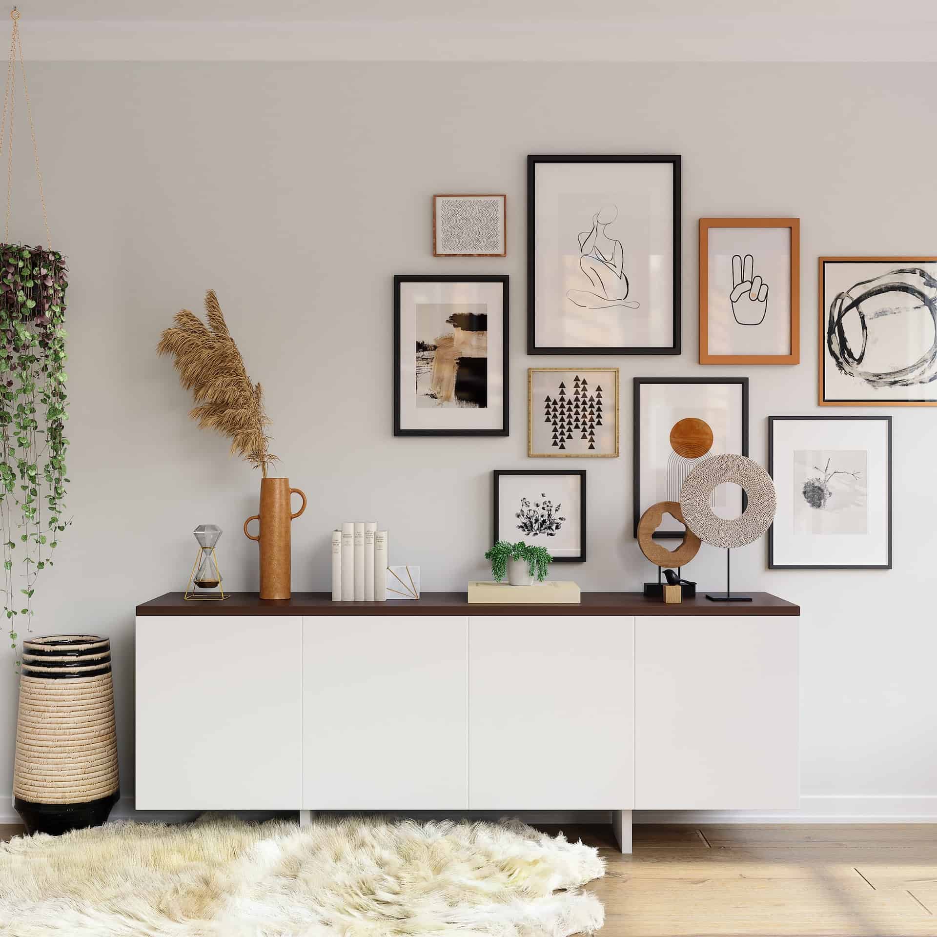
Faced with the choice of paint color for the walls, you should first determine the style in which we want to decorate the space. It is good to choose one leading color, which will appear in each room. This will help us avoid chaos and keep the arrangement coherent.
Remember also, that light is very important – each color comes out a bit differently in daylight and artificial light. Maybe some wall needs to be additionally illuminated, so it will not be a good idea to paint it in a very dark shade. In addition, in interiors poor in sunlight it is better to use warm colors.
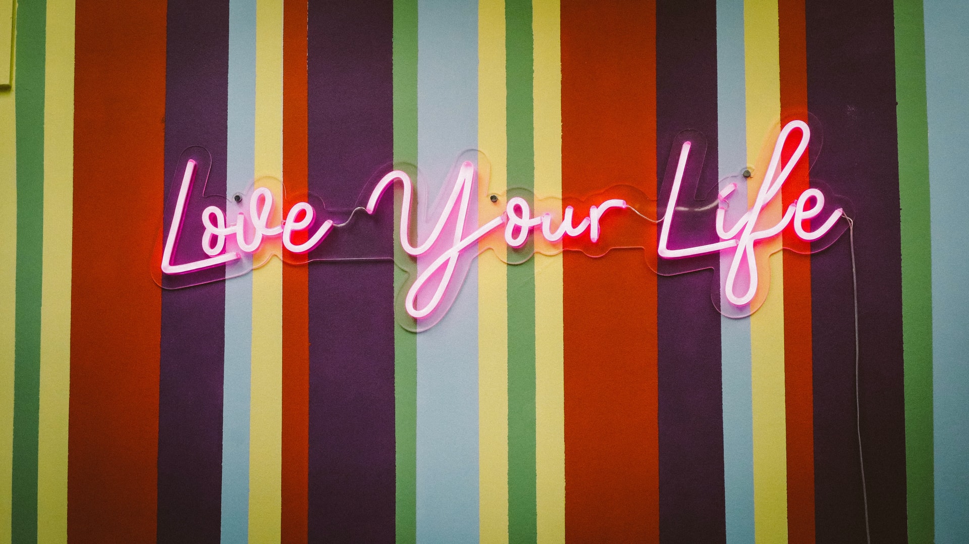
When arranging the interior, we are guided primarily by our taste and the taste of other household members, but we should not stop at that. Colors carry different emotional loads, they can cheer us up, activate or calm us down. It is worth taking this into account.
>> See: Navy blue kitchen – arrangements that will inspire you
For example red adds energy, stimulates to action, symbolizes fire and love. Its intensity can also cause irritation. It is not suitable for children’s room, but in a corridor, kitchen or living room it fits. It can also be skillfully introduced into the bedroom. Orange is very cheerful and energetic, while yellow perfectly revitalizes, brightens and is suitable for almost every room.
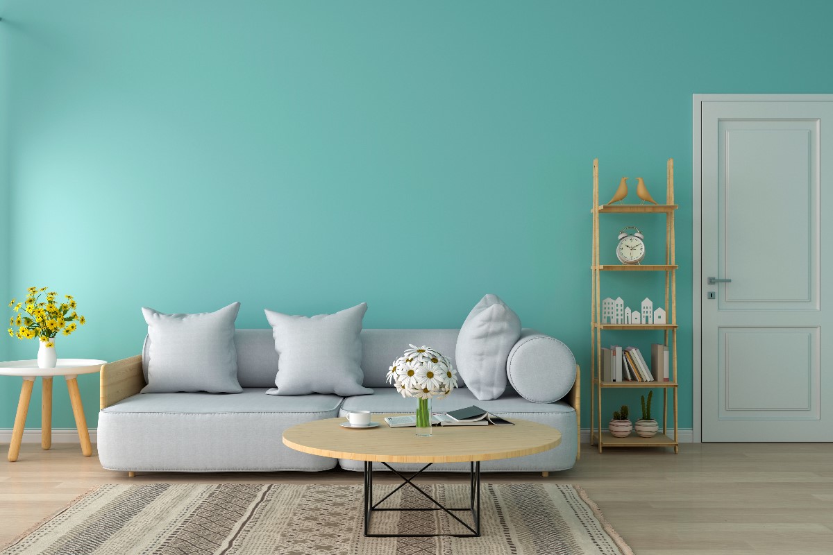
Blue is calming and soothing as it brings to mind the sky and water, and green is the color most often used in offices – it helps creative thinking and promotes relaxation, reducing stress.
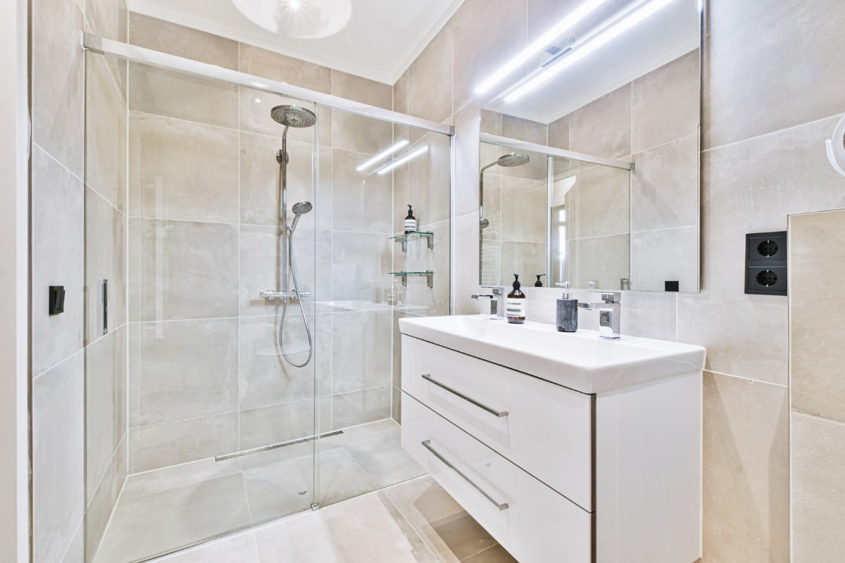
Brown color is perfect for the living room – it gives a sense of balance, stability and confidence, while neutral grays and whites give a sense of purity and harmony. They are the perfect choice for small rooms and bathrooms.
Colors can be chosen in three ways: by choosing two colors that are adjacent on the color wheel, two colors that complement each other through contrast or one color but in different tones and saturation.
This combination brings harmony and peace to the interior, calms us. It looks beautiful in the corridor and the children’s room or office. It can be broken with “warm” accessories and wood.
One intense wall and the rest neutral, with golden accessories, for example in a form of mirror frame, painting or wall lamps. Bottle green is very stylish and also goes well with yellow and dark wood.
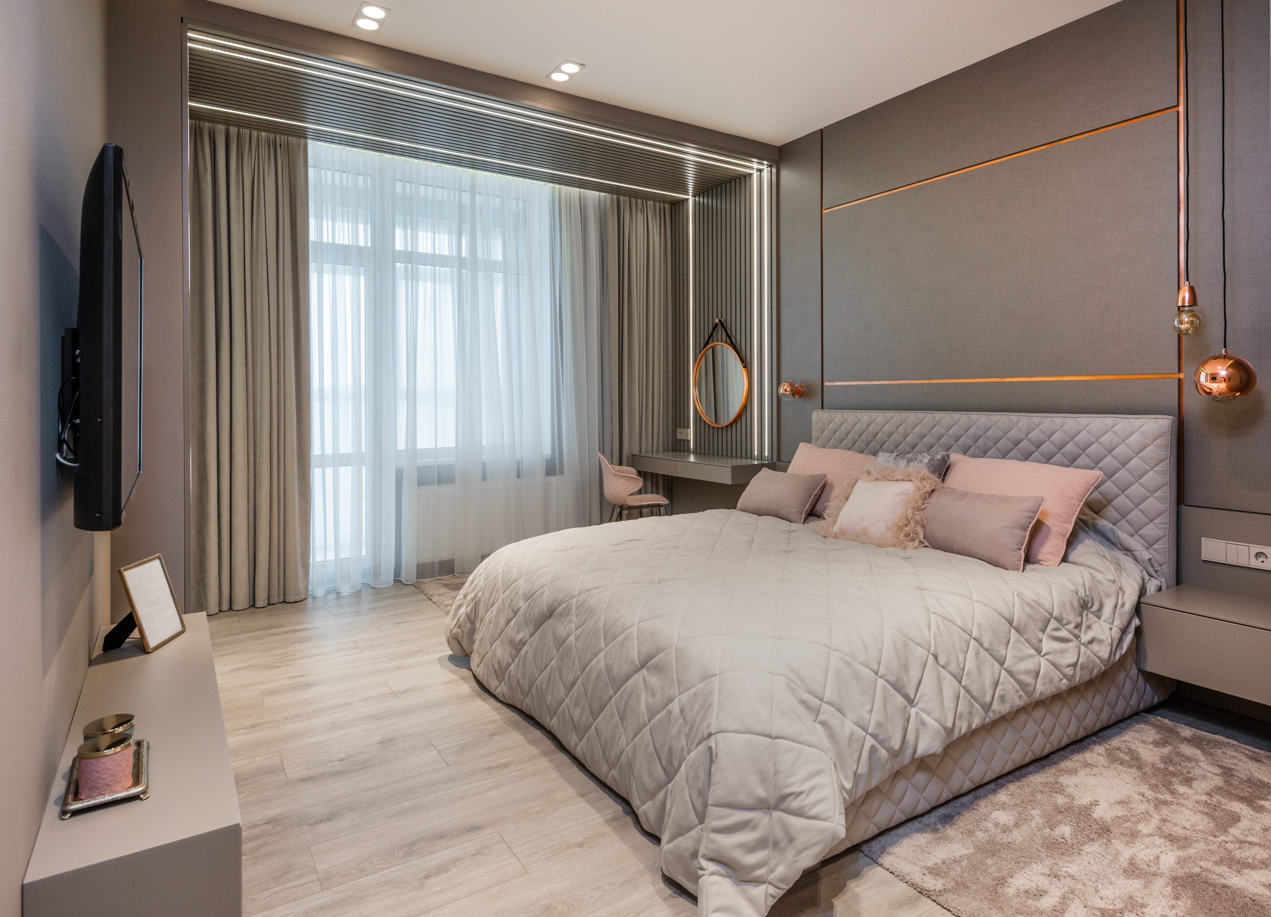
Grey can be perfectly complemented with powder pink, which, for example, will make the bedroom cozier, but will not make the interior dreamy. You can also bet on bright pink in the dining room or living room.
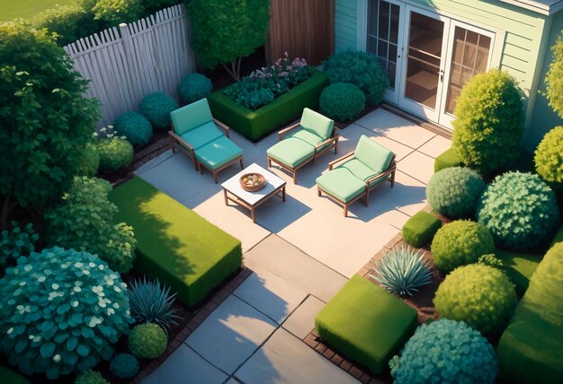
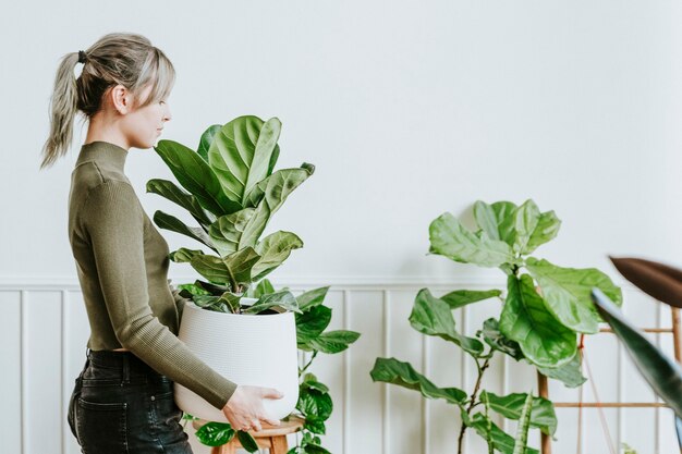
Greenery is worth devoting more space. It is the color of nature, which we strongly need now, so we choose eco materials and fabrics, grow many plants. Greenery will fit to every room. You can accent one or two adjacent walls with it.
This combination is contrasting, classic and timeless, perfect for many interiors. However, be careful not to overdo it. It is better to bet on the predominance of white with a touch of black rather than vice versa.
We also recommend juggling with different shades of blue, which perfectly optically enlarges the interior, and at the same time relaxes. A combination of blue walls with a strong navy blue will work great.
At the end we left red. One such wall or alcove will look great with gray, but you can go a step further and create a slightly oriental interior, adding a purple, pink or blue color.